The homepages of your educational apps are now even more practical!
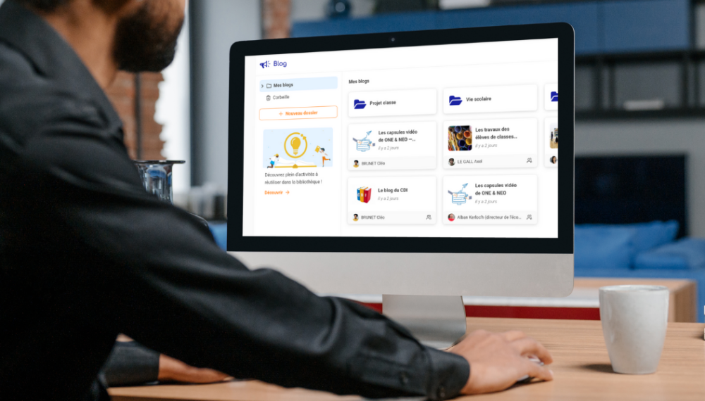
For easier use, the functions and layouts of the homepages for learning apps like Exercises, Pad, Mind Map, and more will be made consistent. The Blog app homepage is the first one to be redesigned, and updates to the other apps will made over time. This way, if you are familiar with the homepage of one app, you’ll be able to easily use all of the other apps as well. The new Blog homepage is more visually appealing and user friendly, and we are proud to introduce it to the platform. Read on for a quick tour of the latest updates.
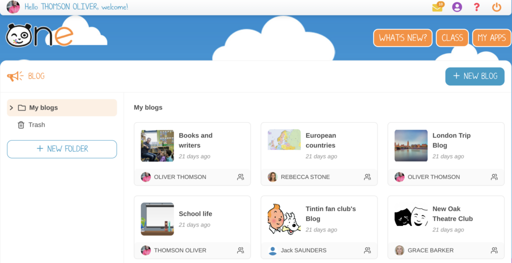
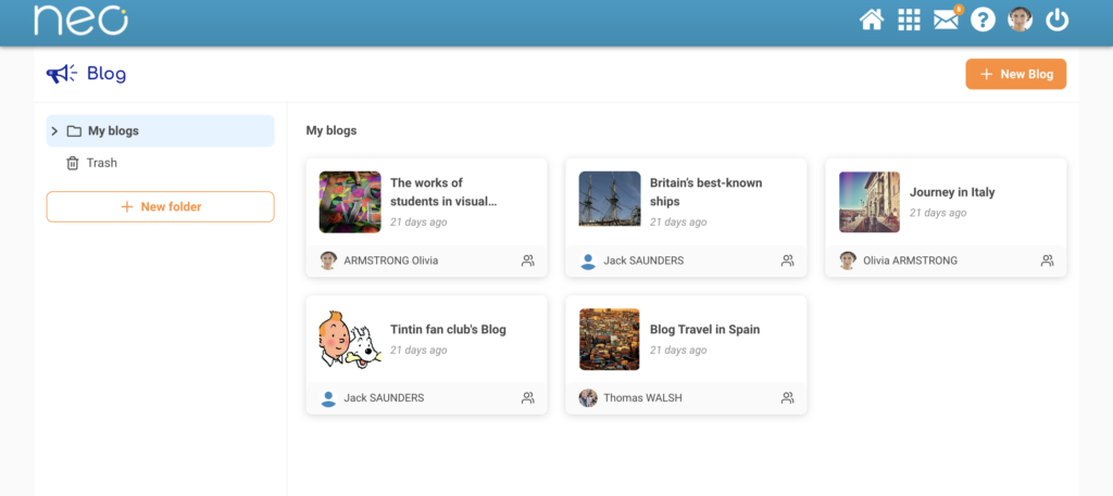
Improved thumbnails
The updated thumbnail is now more visually engaging and provides better information, including the title, last edit date, and creator’s name. The content remains the same, but the presentation has been improved.
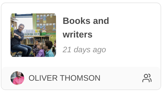
- The icons along the bottom right indicate if the blog is public and shared (or not).
- You can open the action menu by clicking on the three dots.
- Users now just have to click once to access the contents.
Simpler browsing
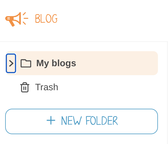
Navigate more easily through your folders with the expandable tree structure.
A bit of housekeeping

Over time and with continued use, users have accumulated a plethora of shared resources, and many have noticed that this can sometimes make navigation less seamless. Now, if you no longer want to keep a file that has been shared with you, you can delete it. It will be moved to the trash, which is emptied at the end of the school year. Any files in the trash will stop triggering notifications and will not appear in your newsfeed.
Better accessibility management
Over the past few years, we’ve been taking proactive steps towards accessibility. At the same time, we’ve been receiving assistance inquiries from individuals with disabilities regarding specific usage cases. Following an external audit of our platforms, the pages of our digital spaces have been revised with consideration for RGAA and WCAG criteria. What does this mean? To facilitate the accessibility of websites and digital services, the Interministerial Directorate of Digital Affairs (DINUM) publishes the General Reference for Improving Accessibility (RGAA), which is partly based on the international WCAG (Web Content Accessibility Guidelines) standards. We have also improved keyboard navigation and screen reader compatibility for software. Lastly, to measure the level of accessibility of these pages, we evaluate them using a simple, open-source tool: Google Lighthouse (an automatic and open-source tool that measures the quality of website pages), which awarded it a score of 98/100.
What’s next?
We are laying the foundation for an even bigger project. In a future version, we will roll out sorting and search features.
comments
Add comment