Web 4.11
August 9, 2023 – First of to be elected, the homepage of Blog got a makeover!
🪴[UPDATES]
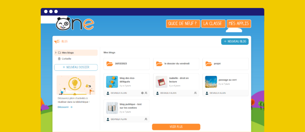
The Blog homepage got a makeover!
To simplify your browsing experience, our team aligns and integrates the features and design of the applications’ homepages. The Blog app homepage is the first one to be redesigned, and updates to the other apps will made over time. This way, if you are familiar with the homepage of one app, you’ll be able to easily use all of the other apps as well. The new Blog homepage is more visually appealing and user friendly, and we are proud to introduce it to the platform.

Read on for a quick tour of the latest updates.
Improved thumbnails
The updated thumbnail is now more visually engaging and provides better information, including the title, last edit date, and creator’s name. The content remains the same, but the presentation has been improved. The icons along the bottom right indicate if the blog is public and shared (or not).

The thumbnail’s functions have been updated as well.
- For example, users now just have to click once to access the content,
- And the action menu is displayed by clicking on the three dots.
Simpler browsing
Navigate more easily through your folders with the expandable tree structure.
All types of content can be moved to the trash

Over time and with continued use, users have accumulated a plethora of shared resources, and many have noticed that this can sometimes make navigation less seamless. If you are no longer interested in keeping a shared file, you can now move it to the trash bin, which will be emptied at the end of the school year. Any files in the trash will stop triggering notifications and will not appear in your newsfeed.
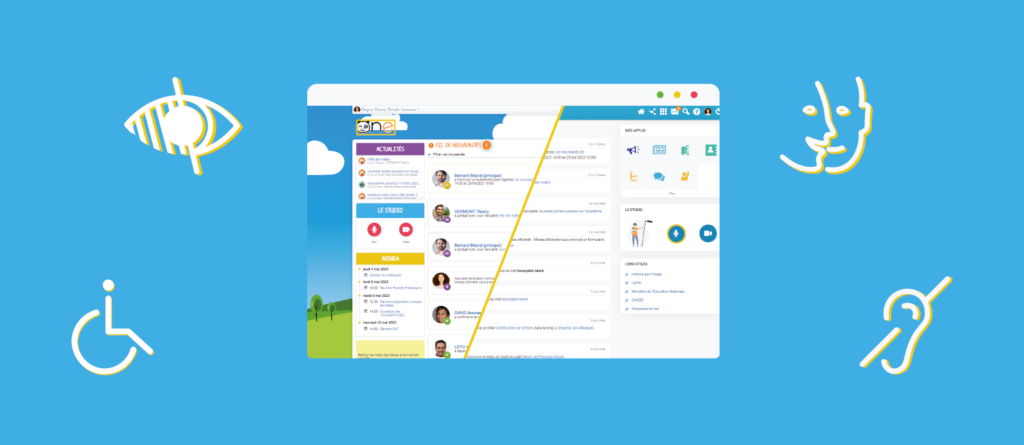
Better accessibility management
Over the past few years, we’ve been taking proactive steps towards accessibility. At the same time, we’ve been receiving assistance inquiries from individuals with disabilities regarding specific usage cases.

Following an external audit of our platforms, the pages of our digital spaces have been revised with consideration for RGAA and WCAG criteria. What does this mean? To facilitate the accessibility of websites and digital services, the Interministerial Directorate of Digital Affairs (DINUM) publishes the General Reference for Improving Accessibility (RGAA), which is partly based on the international WCAG (Web Content Accessibility Guidelines) standards. We have also improved keyboard navigation and screen reader compatibility for software.

Lastly, to measure the level of accessibility of these pages, we evaluate them using a simple, open-source tool: Google Lighthouse (an automatic and open-source tool that measures the quality of website pages), which awarded it a score of 98/100 (compared to 38/100 for the original version).
A direct link to the Library
Need some inspiration? Teachers can now access the Library with just one click through the left-side icon from the applications homepage.
What’s next?
We are laying the foundation for an even bigger project. In a future version, we will roll out sorting and search features.
🚀[IMPROVEMENTS]
To ensure a stress-free start to the new school year, improvements are being introduced to simplify four key processes.
- For News and Admin Console, two highly used applications at the beginning of the school year, query loading times have been shortened.
- From My Account, parents can merge counts themselves, regardless of how they were uploaded (manually or via import).
- In the Admin Console, when merging duplicate user accounts, you can now retain all their affiliations, which will be immediately visible.
- In a manually created group, the administrator can now see all members, even those who have left the school. They can then independently remove users who are no longer associated with the school!
In Form, you can now include images in the response options for multiple-choice and radio button questions.
🐜[FIXES]
Multimedia Notebook
- The duplication feature is now functioning properly for all types of content.
- We have resolved the issue of certain records being locked out.
- We have simplified navigation for users with slow internet connections.
- Additionally, when the same user edits the same Multimedia Notebook in two different tabs, they will now receive a warning indicating it might not save properly.
To make navigating the Directory easier:
- The navigation buttons were updated.
- Your contacts, groups, and share favorites are now displayed by default. Then, you can further refine it with a search or by scrolling!
In the Class Settings app, teachers with several classes can now navigate more easily from one class to the other:
- A drop-down list of all the teacher’s classes is now available.
- Teachers can edit the name of the class by clicking on a dedicated button.
Video recording
- Video recording is now always done correctly, even when the video stops after reaching the maximum duration.
- The title of the audio saves correctly as well, even if it is entered before recording.
Attendance
- Creation of notifications for a parent when an event has been created or modified.
- Incident pagination patch.
- Alert export patch.
Security improvementsin My Account.
In addition, a series of small adjustments has been made to enhance the platform’s day-to-day usage:
- We have switched to a new text message provider for better deliverability.
- Skills: Fixed the issue related to retrieving assignments for student profiles.
- Pages: When using the photo carousel, the photos now remain in portrait or landscape orientation, depending how the user uploaded them.