Discover ONE & NEO Pocket’s new text editor

In tandem with the redesign of the Web editor, our teams have enhanced the mobile App editor to ensure compatibility and improve user experience. Check out these updates now in the Blog!
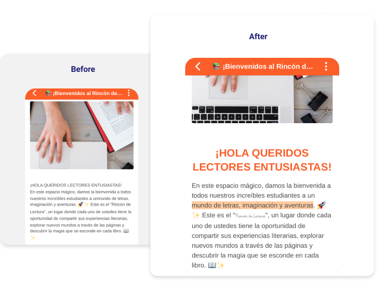
All your beautifully edited layouts on the Web are now easily visible on the mobile app!
In this first phase of the project, we focused on making sure content displays as it was edited. Previously, the layout you created on the web didn’t always appear correctly on the mobile app. Now, readers can see fonts, text styles and sizes, highlighting colors, subscripts and superscripts, all emojis, bullet lists, and alignment. Attachments now have a more aesthetic display. These improvements greatly enhance the reading experience.

More room for writing and creativity
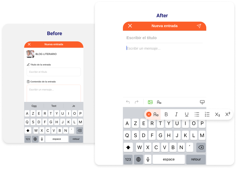
Say goodbye to bulky editing blocks and hello to more creative space. You no longer need to wait to edit your post on the web to unleash your imagination: the editor is now available in the mobile app! Create content with simple formatting options (bold, italic, underline, bullet lists, subscript, and superscript) and insert images as you write, not just at the end. Editing is now easier with the ability to undo and redo content and fold/unfold the keyboard. Additionally, to standardize our apps, like in Mailbox, simply click the airplane icon at the top right to publish your post.

Exciting new feature: you can now edit blog posts directly in the mobile app! When editing content created on the web, you can modify and delete content without affecting its layout.
These updates mark the first phase of this extensive project. In the next version, you can expect even richer editing features, including font selection, size adjustments, and the ability to add videos and audio. Currently, these features are available only on the Blog, but the next applications to benefit will be Mailbox and the Schoolbook.
Read more about ONE Pocket or NEO Pocket.
comments
Add comment